
The font used for the Sinister title is very effective for connoting the mood or theme of death in the film. It does this by using a font that looks like blood is dripping down from the letters. This is backed up by the stale red colour that is used in the font- it almost makes it look like the word has been written in bloody which is very creepy.
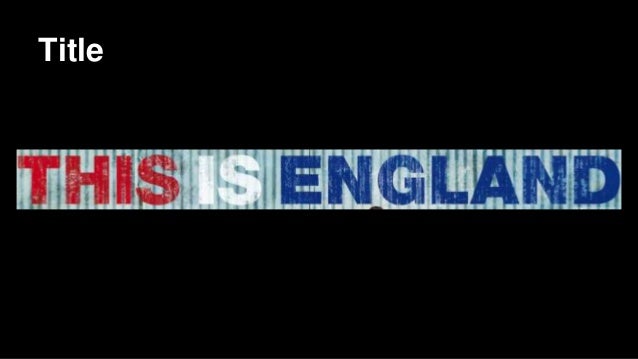
The font used for this is England is a perfect example of a type of font that completely backs the title itself. The fact that the title is bold and all the letters are in capitals implies that this film will be very nationalist based because its almost like an exclamation of the phrase too defend the country. Lastly, the red white and blue patriotic colours further shows the extremities of the national pride in the film.

The font used for the thrilling American TV drama- Breaking Bad is clever because it fills the reader in on the main content of the film. The letters 'Br' and Ba' are taken from the periodic table simply showing that this show will involve some sort of chemistry. I also noticed how the other letters were not fully filled in and some of it was rubbed out which I thought could link to a chalk board at school which of course links to the protagonist's profession as a teacher.
Experimenting with fonts for my film title:
Font One
I like this font because it is very bold and constant. I think this works well with the title because the metallic colour and use of capital letters is professional and legal which is ideal for my film based upon police interrogation and the law. However, I do fear that this font choice is slightly boring in comparison to some of the others and therefore it is not one of my favourites.
Font Two
This font is a little less structured than the first one which I really like because it adds to the sense of crime and breaking the law which is a key theme in my film. Furthermore, I believe that the font reminds me of the writing on a dog tag worn by gang members which again is another big part of my film, especially in the opening sequence.
Font Three
This font is another personal favourite because I like the contrast of dark grey colours giving it almost a dull and deep mood which is desired in this particular thriller film. Furthermore, I think that this style of font represents a jail cell which of course is another part of my film because the criminal that gets caught is threatened to a prison sentence if he doesn't give information.
Font Four
This font is good because it contains lots of representation about the film that will be discovered by the audience after they endure it. The glimpse of light just above the letter G represents that the criminal being interrogated is shedding light onto the mystery police case which I think is very clever. The dark atmosphere could also signify the criminal being alone after being betrayed by his literal partner in crime and the only way out is to give information on his whereabouts.
After researching and considering the different font option I have chose to use the second font because I like the way that it connotes a theme of crime and a breaking of the law.

No comments:
Post a Comment